Every autumn, gridiron traditionalists—reared on a strict diet of single-digit helmet numbers, plain athletic block fonts, and unadorned pants—experience a catastrophic rupture of their tender sensibilities. They gaze upon the modern landscape of college football and weep into their antiquated stadium cushions, flabbergasted by the baffling visual chaos unfolding on their screens. Yet, for those of us who do not measure aesthetic purity by how closely a jersey resembles a vintage photograph, the relentless proliferation of alternate uniforms is a chaotic and energizing change-of-pace. What began as a brazen corporate marketing scheme to entice prospective seventeen-year-old recruits has morphed into a full-blown sartorial renaissance across the college football landscape.
Naturally, not every attempt at breaking tradition yields artistic brilliance. For every jaw-dropping masterpiece that graces the field, there exists a horrific, eye-searing disaster; often courtesy of an overly ambitious design department trying to make “gator skin” or gradient shoulder pads happen (spoiler: they didn’t). But when a program hits the sweet spot, balancing historical reverence with avant-garde panache, the results are surprisingly appreciated and welcome.
We are talking about threads that elevate a standard Saturday afternoon kick-off into high-fashion performance. So, put away your dusty grey sweatshirt and let us embark on an unapologetically opinionated tour through the absolute pinnacle of alternative gridiron attire, dissecting the absolute best alternate uniforms in college football history while simultaneously wading through the hubris and occasionally questionable decisions that brought them into existence.
Oregon’s Endless Closet
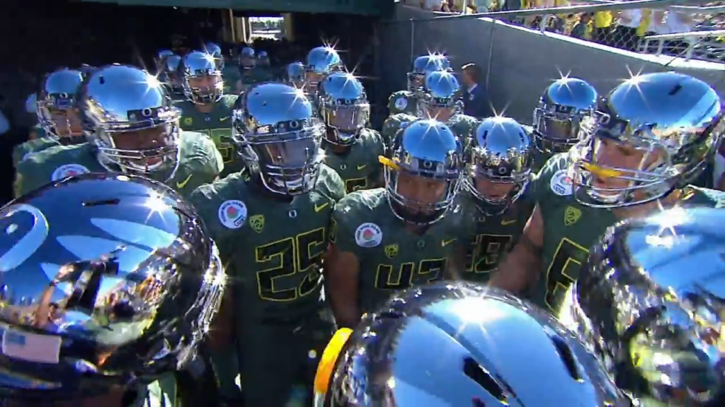
It is impossible to engage in any serious discourse regarding alternate uniforms without paying mandatory homage to the undisputed grandfathers of modern athletic peacocking: the Oregon Ducks, the progenitor of needless ostentatiousness. Back in the late 1990s, armed with an open checkbook from Nike co-founder Phil Knight and a complete disregard for traditionalist scolding, Oregon effectively weaponized fashion in the pursuit of athletic recruitment. They didn’t just participate in the trend; they violently disrupted the entire paradigm, transforming Eugene into a high-octane fashion runway with a football field attached that effectively served as a satire as of itself.
While the Ducks have dropped hundreds of combinations—ranging from the sublime to neon-tinged crimes against humanity—their “Liquid Metal” and “Molded Carbon” color schemes stand out as high-water marks of modern industrial design.
The 2012 Rose Bowl mirror-finish chrome helmets were a cultural watershed moment. Opposing wide receivers were practically blinded by the reflected glare of their own existential dread. The Ducks proved that uniform variations were not merely a gimmick, but a potent psychological weapon, setting off a nationwide arms race among athletic departments scrambling to find their own signature look.
Blackout Mode
If there is one universal law in modern sports aesthetic design, it is this: when in doubt, make it black. The “Blackout” concept has been thoroughly overused, abused, and commercialized to the point of absolute exhaustion, yet when executed with precision, it remains the most intimidating visual flex in all of sports. Here are the designs that have most leveraged the “blackout” color scheme with the most panache.
1. Army Black Knights: “Difference Makers” & Special Forces Homages
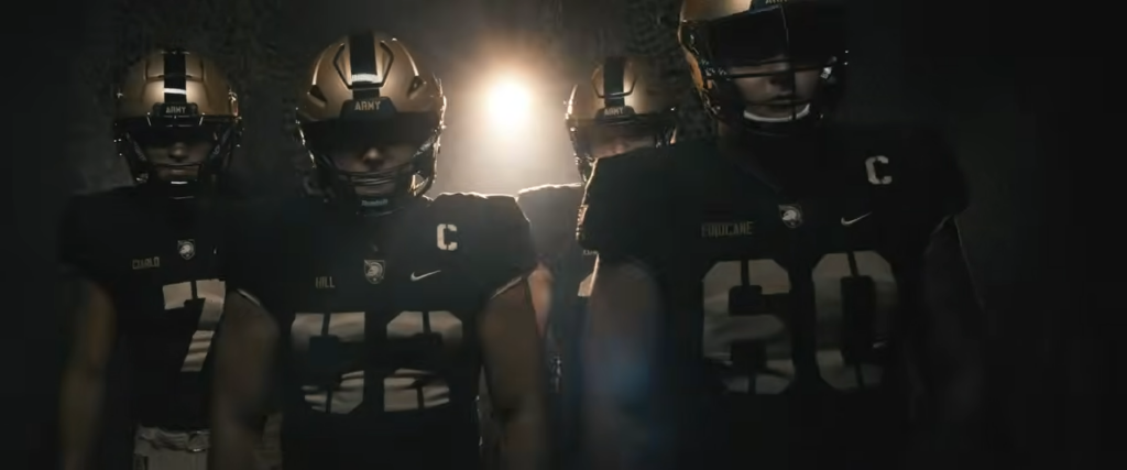
Army’s annual reveal for the Army-Navy Game is consistently a masterclass in thematic storytelling. Unlike civilian programs that just slap black paint on a helmet and call it a night, West Point digs deep into military history. Their Special Forces-inspired iterations feature matte-black lids and subtle insignia, that pays homage to specific combat units. It isn’t just a uniform; it is a walking tactical brief articulating US military history that looks utterly terrifying on a football field.
2. Iowa State: “Cyclone Stealth”
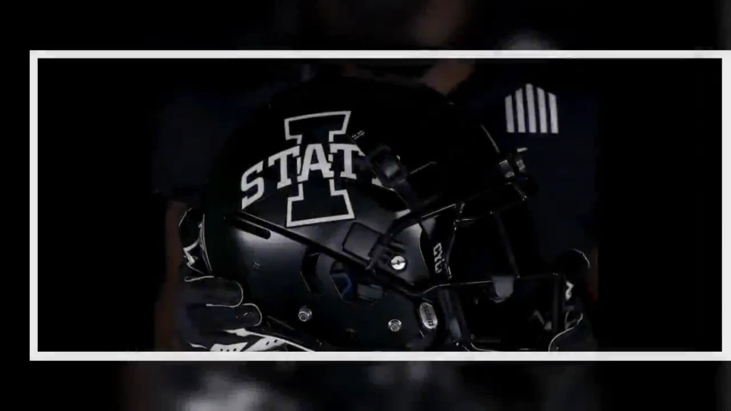
Traditionally shackled to a ketchup-and-mustard color scheme that recalls a local diner’s condiment tray, Iowa State shocked the college football world by dropping their all-black alternates. By stripping away the clashing primary colors and leaning into sleek, dark graphite accents, the Cyclones transformed overnight from Midwestern farm-boys into futuristic sci-fi antiheroes.
3. Ohio State: “Nightfall”
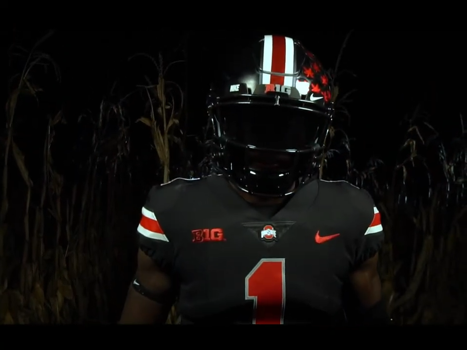
The Buckeyes’ iconic scarlet and grey is sacred ground in Columbus, which made their decision to adopt an all-black ensemble feel borderline sacrilegious to local elders, alums and Ohio statemen. Yet, the execution was flawless. Retaining the classic helmet striping while submerging the entire silhouette into an icy, monochromatic void created an aura of unadulterated menace.
Embracing Nostalgia: Art of the Throwback
Not all great alternative gear looks toward an imaginary cyber-apocalypse; some of the most stunning looks are forged by staring deeply into the rearview mirror. Nostalgia is a hell of a drug, and when teams correctly synthesize their golden eras into modern cut-and-sew technology, magic happens.
Pittsburgh Panthers: Royal Blue & Panther Gold
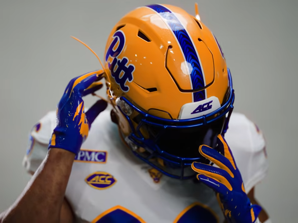
For decades, Pitt labored under a somber, muted navy and gold palette that felt like a dreary afternoon in a rust-belt boardroom. Then, in a moment of sheer divine inspiration, they resurrected their late-1970s and 80s throwback color scheme. The vibrant, electric royal blue paired with a brilliant yellow-gold instantly invigorated the entire program. It was so overwhelmingly superior to their standard home kit that the university had no logical choice but to make the alternate the permanent primary look. Let that be a lesson to all athletic directors: sometimes, revering and embracing the past can serve as the most ultimate form of chic.
Ole Miss: Song of the South
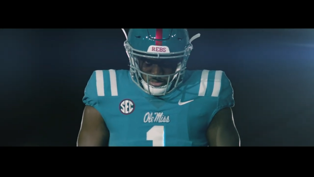
The Rebels’ powder blue helmets and jerseys are an absolute masterclass in Southern sophistication. Originally introduced as a tribute to former quarterback Chucky Mullins, the powder blue accent provides a breezy, high-contrast aesthetic that pops off the green turf like a Renaissance painting. It manages to feel both effortlessly vintage and sharply modern, proving that soft pastels can be just as menacing as aggressive matte black when paired with a defense that hits like a runaway freight train.
UCLA: Muted Powder Blue Perfection
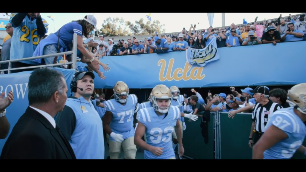
The throwback jersey serves as a way to venerate and honor our forebears, and UCLA’s version of the 1960s look, from the Gary Beban years, makes an unusually good case for our ancestors. The blue is light, a shade chosen in the black-and-white television era so the players would stand out on screen, and it still reads more like a Malibu sky than a corporate brand standard. The numerals are plain block figures in the same font found on high school scoreboards and municipal parking signs. Then come the stripes, the gold loops that curve over each shoulder, the one flourish the design permits itself and therefore the one that matters. The gold helmet carries no graphic manifesto, the pants carry no piping, and nowhere is there a sponsor’s mark asking for attention. The old Bruin kit assumed the football would provide the drama, while the uniforms would be as serene as the blue sky hovering over Pasadena on beautiful Saturday afternoon.
The Out-of-This-World Innovators
Sometimes, a university embraces a hyper-specific regional identity and produces something so wildly unique that you cannot help but applaud the sheer audacity of the execution.
UCF Knights: “Space Game” Series
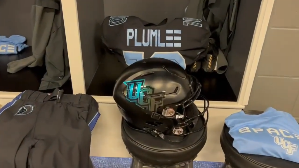
Located just down the road from the Kennedy Space Center, the University of Central Florida has leaned heavily into its aerospace connections for their annual “Space Game” alternate uniforms. These are not merely cool jerseys; they are astronomical easter eggs woven into performance fabric. The most prominent designs UCF has produced include the “constellation helmets,” the “Canaveral Blue Accents,” and the “Mission Patch Details” uniform, each honoring the school’s unique relationship with space exploration. It is nerdy, high-concept, and brilliantly executed—a rare example of themed alternate uniforms that feel entirely organic to the school’s geographical identity rather than a forced corporate marketing gimmick.
Hall of Shame
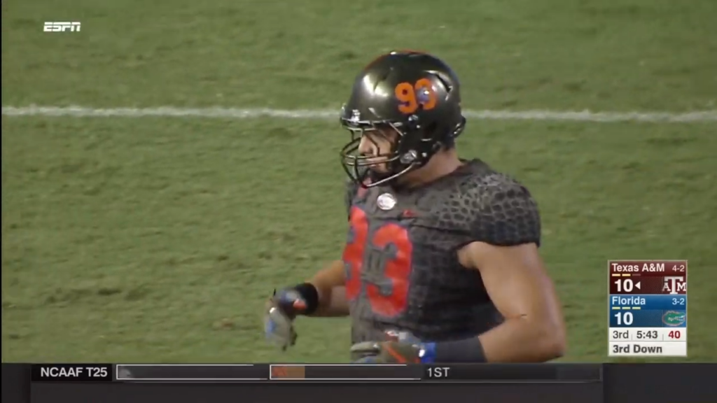
Florida Gators (“Gator Skin”, 2017): A textured swamp-green mesh nightmare that made elite D1 athletes look like oversized, clammy reptilian bath toys.
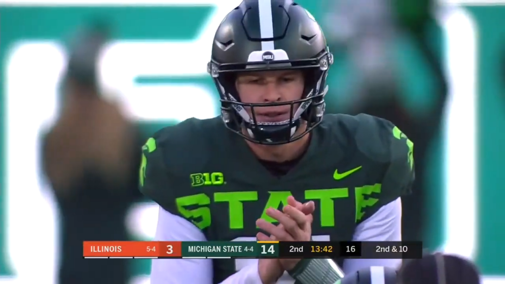
Michigan State (“Neon State”, 2019): Featuring neon lime-green lettering so blindingly aggressive it could be picked up by low-Earth orbit satellites.
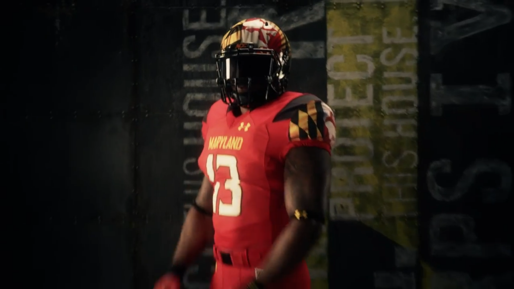
Maryland Terrapins (“Pride Flag Mashup”): A chaotic visual explosion of the state flag that split the fanbase—half loved the audacity, while the other half suffered immediate migraines. I tend toward the latter, they’re horrendous, as messy as the smoldering ruin the program has now find itself in under Mike Locksley.
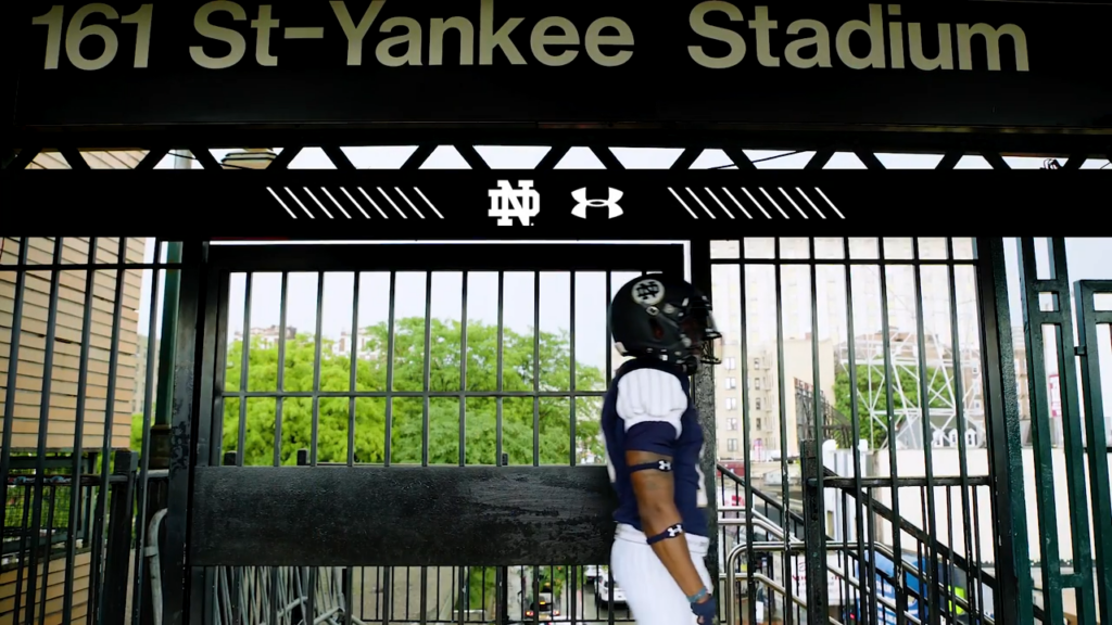
Notre Dame (“Shamrock Series”): A wild roller coaster ranging from brilliant faux-gold leaf helmets to spray-painted graffiti disasters that left golden-dome purists hyperventilating into paper bags.
Why Do They Remain Popular?
Critics can grumble all they want about the erosion of traditional iconography, but the numbers do not lie. Alternate gear drives massive merchandise sales, creates social media engagement spikes that money cannot buy, and serves as an irreplaceable currency in the cutthroat realm of modern athletic recruiting. Eighteen-year-old athletes want to play for programs that look cool, feel dynamic, and offer them the chance to step onto a national broadcast looking like a custom video game character.
Beyond the recruiting trail, these uniform variations offer a rare moment of levity and artistic expression in a sport that often takes itself far too seriously. They allow universities to celebrate local heritage, honor military branches, commemorate historical teams, or simply flex their creative muscles on a high-visibility stage.